A death cross is when the 50-day moving average of a stock or index closes below its 200-day moving average. It sounds like the end of the world, and the headlines treat it that way. I checked all 27 death crosses on the S&P 500 since 1971: a year later the index was higher 20 times, and the median gain was about the same as from any random day. The signal rarely calls a crash. It does show up before most of the big ones, though.
What is a death cross?
Take two simple moving averages of the daily close: the 50-day (about ten weeks) and the 200-day (about ten months). When the short one crosses below the long one, that is a death cross. The opposite, the 50-day crossing back above the 200-day, is the golden cross. The same definition works on any chart – a single stock, an index, gold or Bitcoin – which is why screeners publish “death cross stocks” lists every day. StockCharts’ ChartSchool uses the same 50/200 definition.
Both lines are averages of past prices, so the cross is late by design. By the time the 50-day gets below the 200-day, the market has usually been falling for weeks. In my data the S&P 500 was already a median 8.5% below its highest close of the previous 12 months on the day of the cross. So the question isn’t “is the market weak?” – it is. The question is whether the weakness keeps going.
How often is the death cross right? 27 signals on the S&P 500
I used Yahoo Finance daily closes of the S&P 500 (^GSPC, price only, no dividends) from January 1970 to 25 September 2026. The first death cross the data can see is September 1971, the latest April 2025. For every one of the 27, I measured the index 1, 3, 6 and 12 months later (21, 63, 126 and 252 trading sessions) and compared it with the same measure taken from every day in the sample. The table shows how often the index was higher and the median change.
| After | Death cross | Any day |
|---|---|---|
| 1 month | 56% up, +1.8% | 62% up, +1.1% |
| 3 months | 67% up, +4.5% | 67% up, +2.8% |
| 6 months | 67% up, +6.4% | 71% up, +5.2% |
| 12 months | 74% up, +11.4% | 76% up, +11.1% |
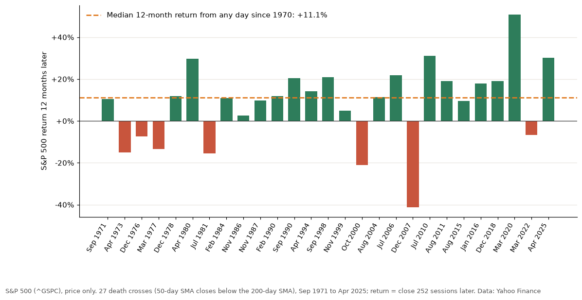
That is not what a sell signal looks like. A year after the cross the S&P 500 was up 20 times out of 27, with a median return of +11.4% against +11.1% from any day. The averages tell the same story: +8.8% after a death cross against +9.4% from any day. With 27 signals, a gap of 0.6 percentage points is noise.
Is a death cross bearish? Only in the tails
The chart above is the whole argument in one picture. Most bars are green and many are taller than the orange line. Then there are two very red ones: October 2000 and December 2007. The cross of 21 December 2007 came at 1,484.46. Within the next 12 months the S&P 500 closed as much as 49.3% lower, and it ended the year 41.3% down. After the October 2000 cross the index fell up to 30.9% within a year, and the golden cross didn’t come back until May 2003, 634 sessions later.
Those two are the only times the market dropped another 20% or more within a year of the cross. A smaller follow-through was common: in 10 of the 27 cases the S&P 500 closed at least 10% below the cross level at some point in the next 12 months. So the honest summary is this. Most death crosses were followed by nothing special. But every long bear market in the sample – 1973–74, 2000–02, 2007–09 and 2022 – had a death cross early on. You can’t have a long decline without the averages crossing, so the cross is part of every slow crash, not a forecast of one. The fast ones are different: in 1987 and 2020 the cross came after the damage was done.
Can a death cross be bullish? The April 2025 example
The last S&P 500 death cross is a good lesson in how late the signal can be. The tariff sell-off took the index to a closing low of 4,982.77 on 8 April 2025 (intraday 4,835.04 the day before). The 50-day only crossed under the 200-day on 14 April, with the index at 5,405.97 – already 8.5% above that low close. The golden cross followed on 1 July at 6,198.01, and 12 months after the death cross the S&P 500 was 30.3% higher.
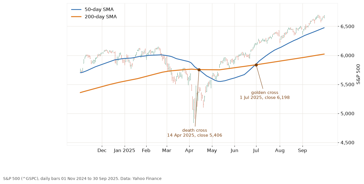
Anyone who sold on the headline sold after the bottom. This happens more often than people think: after the cross, the golden cross came back within about three months (63 sessions) in 9 of the 27 cases. In November 1986 and November 1999 it was back within five sessions. The median wait was 78 sessions, a bit under four months. March 2020 is the extreme case – the cross came a week after the Covid low, and the index was up 50.7% a year later.
How I would use a death cross
Not as a sell button. On its own it says “the trend has turned down”, which the chart said a few weeks earlier. What it does well is keep you out of the long, grinding bear markets, and it charges for that in whipsaws. I tested the full rule – buy on the golden cross, sell on the death cross – in the Setup Lab golden cross test. Over 56 years it made 7.5% a year against 8.4% for buy and hold, with a maximum drawdown of −33.9% against −56.8%. Less return, much less pain. Whether that trade is worth it depends on how well you sit through a drawdown.
For a single trade, the cross is context, not an entry or an exit. My stop comes from the chart – below the swing low, as in stop loss trading – not from two averages touching. If a stock I hold prints a death cross while it’s still above my stop, I look at why it’s weak and whether the setup is still valid. If the stock is already under my stop, the cross doesn’t matter, because I’m out. For the same kind of trend filter on the Nasdaq-100, see timing QQQ with the 200-day average.
Where the S&P 500 is now
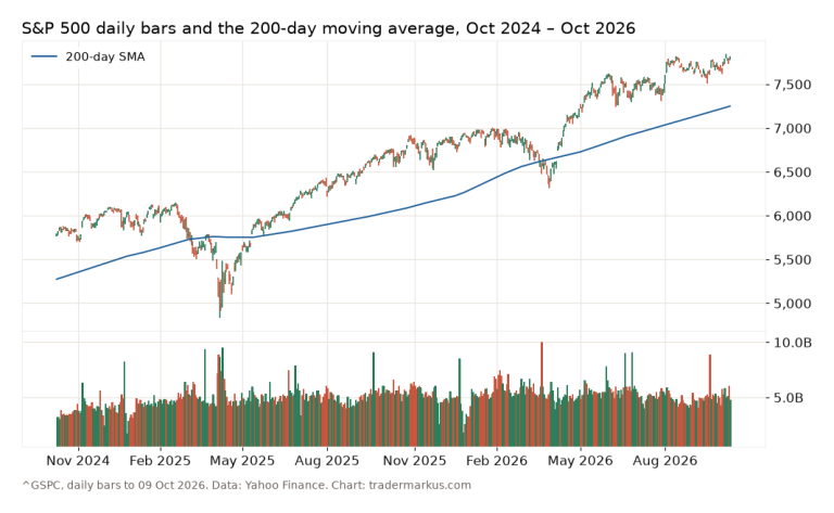
No death cross in sight. On 9 October 2026 the S&P 500 closed at 7,811.54, with the 50-day average at 7,697 and the 200-day at 7,251. The 50-day is 6% above the 200-day, and the last cross was the golden one of 1 July 2025. The levels I’m watching this week are on the weekly levels page.
FAQ
How often is a death cross accurate?
On the S&P 500 since 1971, 7 of 27 death crosses were followed by a lower index 12 months later. That is roughly the same share as from any random day (24% of 12-month periods were negative). Two crosses, in 2000 and 2007, came before drops of 30% or more.
Is the golden cross the opposite?
Yes: the 50-day moving average closes above the 200-day. On the S&P 500 there were 28 golden crosses in the same period. It is just as late as the death cross, only in the other direction.
Does a death cross work on single stocks and Bitcoin?
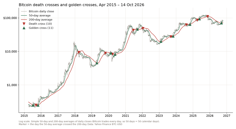
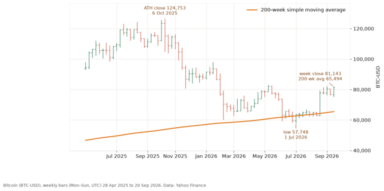
The definition is the same on any chart. A single stock can fall much further than an index, so the tail risk matters more there. This study covers only the S&P 500; I didn’t test individual stocks here. On one stock the averages also cross more often: Boeing’s 50-day and 200-day crossed six times between February 2025 and September 2026 (my Boeing stock chart read). On Bitcoin I went through all 10 Bitcoin death crosses since 2015: a year later it was higher after 5 of 9, against 72% of all days.
The death cross is a trend signal with a scary name. It has warned before most of the big ones, and cried wolf plenty of times in between. Keep the stop on the chart and your position sized, and you won’t need a moving average to tell you when to panic.
Not financial advice. This is educational content, shared for information and entertainment only, and it is not a recommendation to buy or sell any asset. Backtests and past results do not guarantee future results, and the numbers or charts here may contain mistakes. Trading carries risk, including losing all the money you put in. Do your own research before you make any decision.